English
 Tiếng Việt
1. What is Basic Charting?
.png)
Basic charting involves the creation of visual representations such as graphs, plots, and diagrams to depict data. These visual tools help illustrate relationships between variables, trends over time, and data distributions. The primary objective of charting is to simplify complex datasets, facilitating efficient data analysis and decision-making processes.
2. Types of Basic Charts
Various chart types are designed to serve specific data analysis purposes. Understanding each type's unique features and applications is crucial for effective data presentation. Here are some of the most commonly used charts:
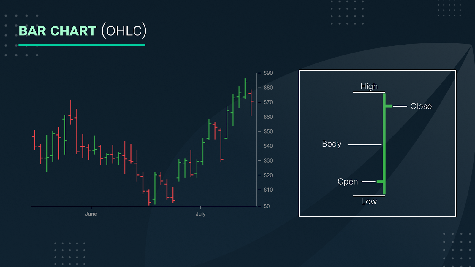
Bar Charts
Bar charts are utilized to compare quantities across different categories. Each bar represents a category, with its length or height corresponding to the category's value. Bar charts are particularly effective for comparing discrete data points, such as sales figures across different regions or revenue by product category.
Considerations: When using bar charts, it's advisable to place categories on the horizontal axis (x-axis) and values on the vertical axis (y-axis) to enhance readability.
Line Charts
Line charts are ideal for visualizing data trends over time. They consist of data points connected by straight lines, making them suitable for displaying continuous data. Line charts are commonly used in time-series analysis, such as tracking stock prices, temperature variations, or sales performance over multiple periods.
Considerations: Line charts are particularly effective when illustrating continuous data trends and highlighting fluctuations over time.
Pie Charts
Pie charts depict the proportional relationships of parts to a whole. Each slice of the pie represents a category's contribution to the total, with the entire pie summing to 100%. Pie charts are useful for showing percentage distributions, such as market share across companies or budget allocations.
Considerations: It's best to use pie charts when dealing with a limited number of categories (typically fewer than five) to avoid clutter and ensure clarity.
Scatter Plots
Scatter plots illustrate the relationship between two variables by displaying data points on a two-dimensional axis. They are useful for identifying correlations, trends, and outliers within datasets. Scatter plots are commonly used in statistical analyses to examine how one variable affects another.
Considerations: Ensure that both variables exhibit sufficient variability to produce meaningful scatter plots, and be cautious of overlapping data points that may obscure patterns.
Histograms
Histograms represent the distribution of a continuous dataset by grouping data into bins or intervals. They display the frequency of data points within each interval, providing insights into data distribution, central tendency, and variability. Histograms are particularly useful for understanding the distribution of numerical data.
Considerations: When creating histograms, choose appropriate bin sizes to balance detail and readability, and ensure that bins are mutually exclusive and collectively exhaustive.
3. How to choose the right chart

Selecting the appropriate chart type is essential for effective data communication. The choice depends on the nature of the data and the specific insights you intend to convey. Here are some guidelines:
-
Bar Charts: Use when comparing quantities across different categories.
-
Line Charts: Use to display trends over time or continuous data.
-
Pie Charts: Use to show parts of a whole, especially when dealing with a small number of categories.
-
Scatter Plots: Use to examine relationships or correlations between two variables.
-
Histograms: Use to depict the distribution of continuous data.
4. Best Practices for Creating Effective Charts
To ensure that your charts effectively convey the intended message, consider the following best practices:
-
Simplify the Design: Avoid unnecessary elements that do not add value to the chart. Focus on presenting the data clearly and concisely.
-
Label Axes and Include Titles: Clearly label all axes and provide descriptive titles to help viewers understand the chart's context and purpose.
-
Utilize Color Strategically: Use color to differentiate data series or highlight key points, ensuring that color choices are accessible to all viewers, including those with color vision deficiencies.
-
Maintain Consistent Scales: Use consistent and appropriate scales on axes to accurately represent the data and facilitate meaningful comparisons.
-
Limit Data Overload: Avoid overcrowding charts with excessive data points or categories. Focus on the most relevant data to maintain clarity and impact.
-
Provide Context: Whenever possible, include reference lines, benchmarks, or annotations to provide context and enhance the interpretability of the chart.
5. Conclusion
Mastering basic charting techniques is crucial for effective data analysis and communication. By understanding the various types of charts and their appropriate applications, you can create visualizations that make complex data accessible and insightful. Whether you're illustrating trends, comparing categories, or displaying distributions, selecting the right chart and adhering to best design practices will enhance your ability to convey information clearly and effectively.
As you embark on your charting journey, experiment with different chart types and practice creating them with diverse datasets. This hands-on approach will deepen your understanding and proficiency, enabling you to choose the most effective chart for any data visualization challenge.
Read more:
.png)
.jpg)